
Personal capital is one of the strongest financial aggregators out there.
Dashboard
It’s important to know your net worth. Ever intrigued by one of those “top 10 richest people” listicles? What’s defined as rich is usually measured based on net worth. Even if you make north of $200,000 a year, if you don’t have an effective saving, investing, and tax optimization strategy, you can very easily end up with $0 in balance.
And what counts towards the current networth includes bank account balance, investment portfolios, house/car/boat/jewlry/art you own. As I will show you later on, Personal Capital Retirment Planner also lets you account for any future assets such as an expected inheritance, pension, social security.
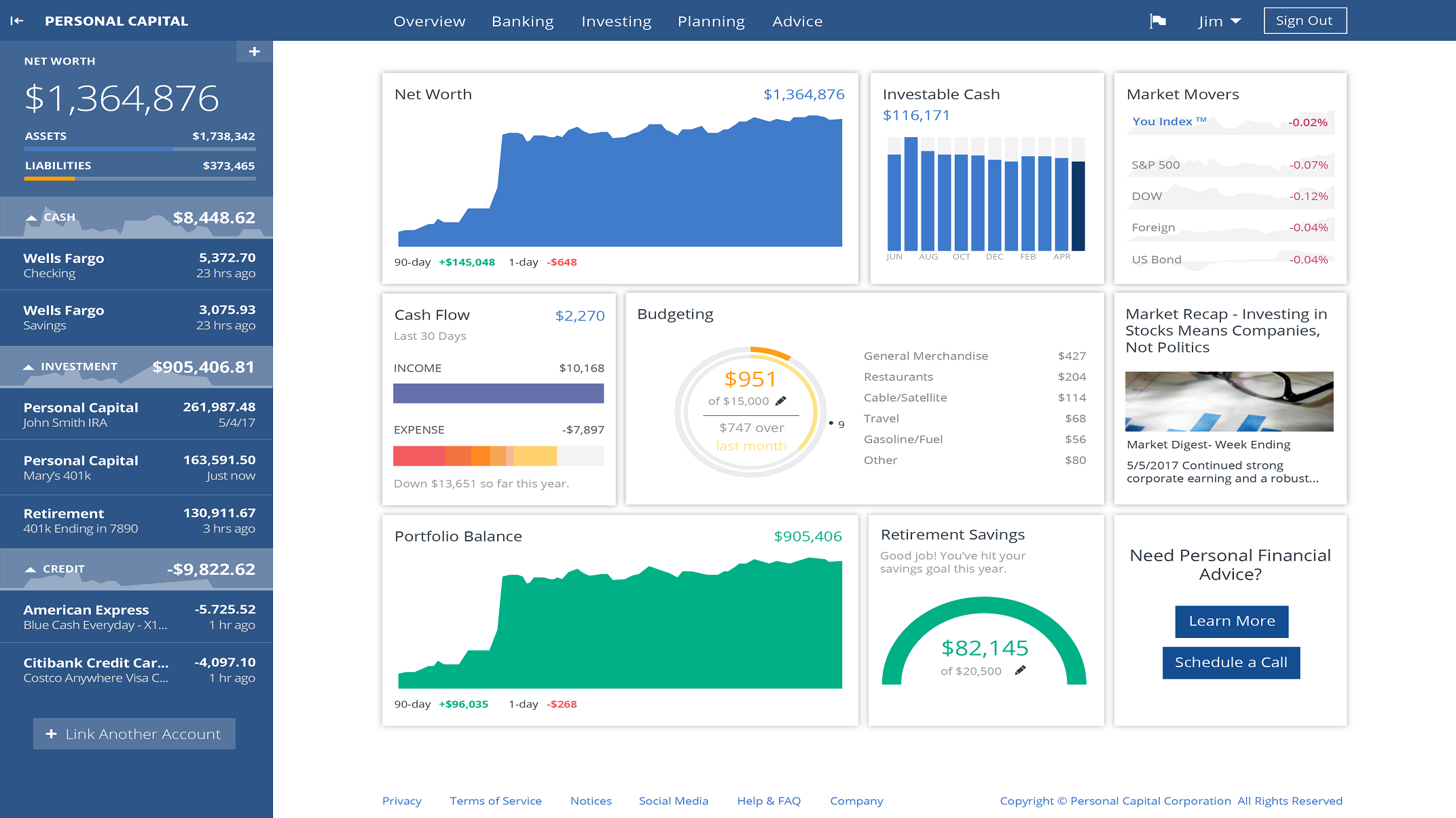
Once you have aggregated various financial assets, you will see a dashboard like this, showing you the trend of your net worth, investible cash, your cash position, budgeting, etc. Personal Capital also provided informative recommendations shown in lower right text box. This is a great way to have a bird’s eye view of your financial health.
Cashflow
2017 was a good year for me. I achieved an overall positive cashflow of $87,585. It’s not easy. It took discipline. An later, I will show you where my cash outflow vulnerabilities are. Oct was
The primary way of growing your networth is through income events. The Cash Flow dashboard allows you to see the percentage makeup of different income events, such as regular salary, rental income if you have an investment property, interest from a saving account, divident from investments, or even travel credits if you have a credit card like the Chase Sapphire Reserve. You can customize the description, category, and tags for better reporting.
The donut chart is a good way to viscerally understand what’s going into your pocket. If you think you are earning lots of interest? Check again, those attractive 2% API on a high-yield saving account is far less compared to your day job.
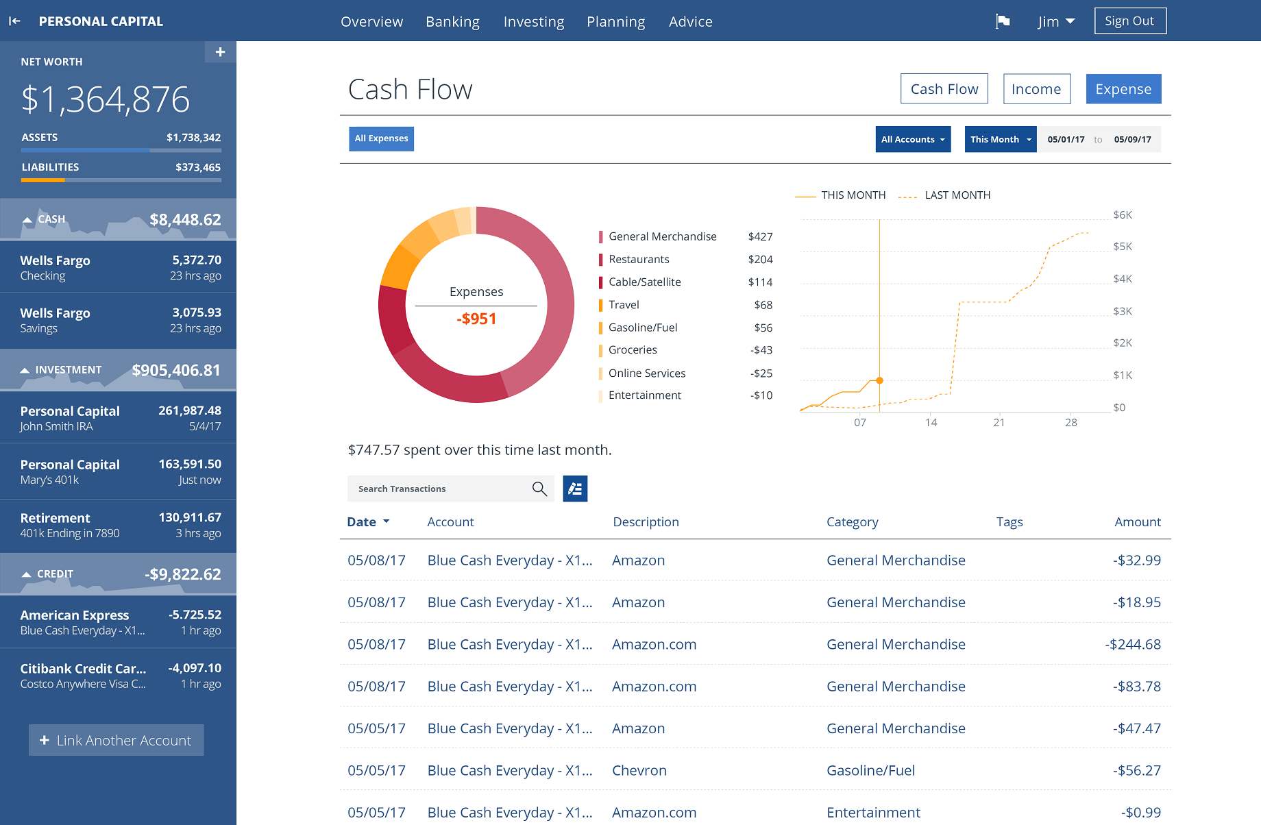
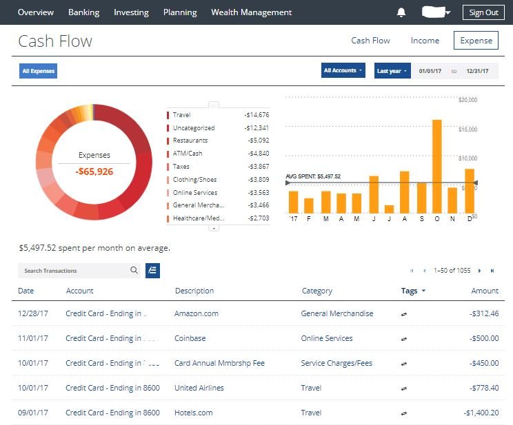
Expenses
This view is always sobering for me. The donut chart is telling a clear story that if I want to preserve my networth, I need to reduce my leisure travel and restaurant habits. You can use this dashboard to review your spending habits, identify the time of the year when you are vulnerable to those buy, deals, signals.
Investing/Portfolio
Now let’s look at the next component of your net worth, your investment. With all your financial accounts aggregated in Personal Capital, you can see how your portfolio is performing against major indices such as the S&P 500, and the total Foreign market. This tool also lets you select an individual investment holding, such as the a single stock, bond, or even alternative asset classes like the crypto-currency.
You can see that across all my accounts, shown in blue and labeled as “Your Index”, I’m outperforming both the S&P 500, in orange, and the Google stock, in grey, in the last 90 days. While it’s not comforting given the direction of the market in 2018, I managed to outperformed the major indices through diversification.

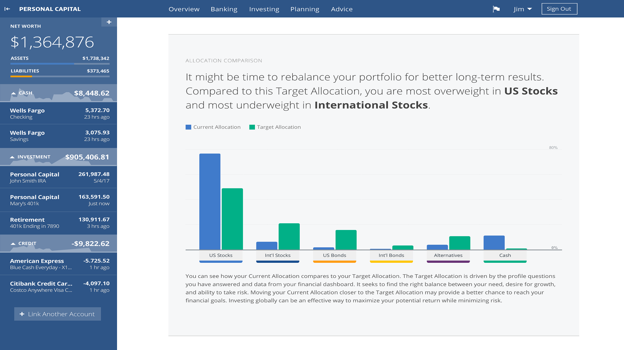
There are multiple ways to see your diversification status. The most interactive and detailed way is to click on the Allocation button, or go to the investing tab from the top, then select Allocation. From there, you can see the percentage breakdown of your portfolio between International Stocks, U.S Stocks, International Bonds, U.S Bonds, Cash, and Alternatives. These are the widely accepted categories, since each are sufficiently large in size, distinct in flavor, and historically had little to moderate correlations. But how did I arrive at this allocation? Personal Capital actually gives you a personalized recommendation.
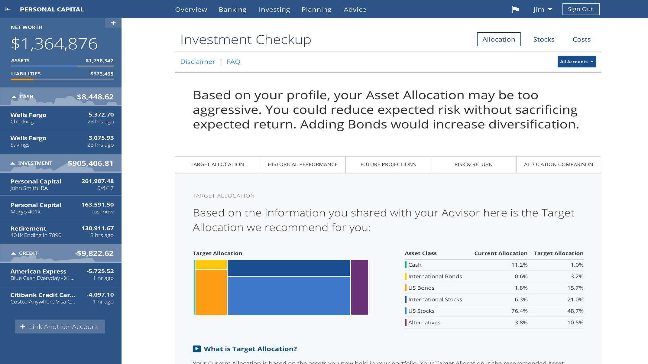
Investment Checkup
The true magic of Personal Capital is in its personalized financial calculators: Retirement Planner, Retirement Fee Calculator, and Investment Checkup. When you click on Planning in the top menu bar, you can select Investment Checkup. Below is a screenshot of a review of my current portfolio. I recommend reading it from the bottom, where my investment strategy is shown in a linear scale from conservative 0 to aggressive 10. Generally, the younger you are and the more income you have, the more aggressive you should be as in my case, where I have a 9 on aggressiveness. With a high historical return of 9.1%, I also face an elevated risk of 14.5%.
Higher up in the dashboard, my current allocations in percentages align closely with what the Personal Capital Strategy recommends based on my growth goal. The only large discrepancy is in U.S Stocks, which I recently withdrew funds from to purchase another cool investment. I’ll delve into that in another time.


As a first time user, you have to create your investment profile by clicking on the link in the red box. After answering a few questions, the checkup tool generates a Target Allocation for you.

You can drill down further to compare our allocation against the recommended allocation by sector and by style. Given the stronger growth of tech sector and U.S. large cap stocks in the recent years, my portfolio became overweighted accordingly. To get to my recommended allocation, I could rebalance the portfolio myself, or I can use Personal Capital’s wealth management, which does automatic rebalance for you with a fee.

Retirement Planner
Another of my favorite tools is the retirement planner. It’s perhaps the single best financial calculator I’ve seen. The premise is simple, you put in your income events on the left, and spending goals on the right. The tool would then show
- A score of retirement outlook in percentage. In the scenario below, it shows that I have a 87% chance in reaching my lifetime’s spending goals
- An area graph with two areas. The deep blue area that stretches through the age of 98 below reflects the portfolio balance if the market performs according to historical average. The light blue area shows what would happen to your portfolio if the market performs at the bottom 10% of historical trends.
There are couple ways to use it.
- Change the different income and spending events, and see it impacts your portfolio forecast. You can save a scenario by clicking on the yellow New Scenario button on the left. This would let you compare your percentage rates. In the screenshot below, you can see that in my second scenario, where I retire in 2019, without further wage from work, my chance of hitting the spend goal would decrease to 35%.

- If you switch the view from Market Condition to Asset Location, it gives you a view of the optimal withdraw and balance strategy based on the type of your portfolio.
